- 首页
- International
- 艾特奖
- 文化节
- 服务体系
-
网站导航
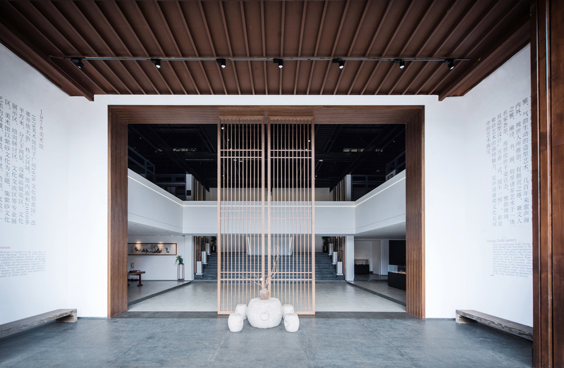
1978美术馆,打破了一般人对美术馆 “博而杂”的印象。设计采用简洁明快的线条与大片空间的留白为主,留白,放诸整个背景中,不仅不会单薄,反而载入了更多丰富想象力,与壶品展示、文化元素遥相呼应,形成一个有着内在信息逻辑框架的艺术空间。 在强调内在逻辑之余,设计师在设计过程中还特别注重与外部环境的相生相融,无论是建筑风格,还是色彩选择,都力求与周边环境和谐共融。
白天的美术馆在阳光的沐浴下反射出柔光,辐射周围,尽显暖意。木质屏风和蕴含文化气息的书画,给人的第一印象是朴实而精美。
登门入庭,入门唯觉一庭“白”,简约空灵、清新素雅,化繁为简的生活智慧,张弛有度的空间力量,彰显当代最流行的设计美学。室内空间设计元素主要凸现出“壶”的展示为主体,令建筑空间与紫砂壶文化交融并包,展现出高度艺术性,审美性。
1978美术馆的迷人之处,在它不设限自由,楼梯间延用了大厅简洁明快的线条,选用蕴含着浓厚的文化气息古物摆设,行走在这里,宛如沉醉在美学的协奏曲中,在这里深切感受到文化艺术的“有趣”表达。
一楼、楼梯和二楼空间的不经意过渡,游赏漫步于这里,感受视觉上带来的盛宴。简约明快的线条,大片留白以及平衡和对称手法,柔和了灰色与白色带来的硬度,来呈现低调奢华和美学,添加几分诗意。
极简的线条,巧妙的灯光,呼应了整座美术馆的设计风格。通道设计采用玻璃隔开1978美术馆,打破了一般人对美术馆 “博而杂”的印象。设计采用简洁明快的线条与大片空间的留白为主,留白,放诸整个背景中,不仅不会单薄,反而载入了更多丰富想象力,与壶品展示、文化元素遥相呼应,形成一个有着内在信息逻辑框架的艺术空间。 在强调内在逻辑之余,设计师在设计过程中还特别注重与外部环境的相生相融,无论是建筑风格,还是色彩选择,都力求与周边环境和谐共融。
白天的美术馆在阳光的沐浴下反射出柔光,辐射周围,尽显暖意。木质屏风和蕴含文化气息的书画,给人的第一印象是朴实而精美。
登门入庭,入门唯觉一庭“白”,简约空灵、清新素雅,化繁为简的生活智慧,张弛有度的空间力量,彰显当代最流行的设计美学。室内空间设计元素主要凸现出“壶”的展示为主体,令建筑空间与紫砂壶文化交融并包,展现出高度艺术性,审美性。
1978美术馆的迷人之处,在它不设限自由,楼梯间延用了大厅简洁明快的线条,选用蕴含着浓厚的文化气息古物摆设,行走在这里,宛如沉醉在美学的协奏曲中,在这里深切感受到文化艺术的“有趣”表达。
一楼、楼梯和二楼空间的不经意过渡,游赏漫步于这里,感受视觉上带来的盛宴。简约明快的线条,大片留白以及平衡和对称手法,柔和了灰色与白色带来的硬度,来呈现低调奢华和美学,添加几分诗意。
极简的线条,巧妙的灯光,呼应了整座美术馆的设计风格。通道设计采用玻璃隔开,内摆放着芦苇,如画框一般定格的风景,制造宜人的视野,人们在通道穿行的途中,也能不经意感受到大自然的美。,内摆放着芦苇,如画框一般定格的风景,制造宜人的视野,人们在通道穿行的途中,也能不经意感受到大自然的美。
展厅,没有繁复的雕饰,框架结构下陪衬白壁,平衡了布局,整个空间通透而具有观赏性。纵观整个展厅,不禁让人联想到一代宗师那些丰富的人文素养加上精练制壶技艺,以及流畅朴实但又充满意境和想象空间的文字。
In 1978, the art museum broke the impression of "broad and miscellaneous" by ordinary people. The design mainly adopts simple and bright lines and large space blank, which is put into the whole background, not only not thin, but also loaded more rich imagination, echoing with the display of pot products and cultural elements, forming an art space with internal information logic framework. In addition to emphasizing the internal logic, the designer also pays special attention to the harmony with the external environment in the design process. Both the architectural style and the color selection strive to be harmonious with the surrounding environment. During the day, the art gallery reflects soft light in the sunshine, radiating around, showing warmth. Wooden screens and paintings with cultural atmosphere give people the first impression of simplicity and delicacy. When entering the court, you can only feel the "white" of the court. It is simple, empty, fresh, simple and elegant. It turns complexity into simple wisdom of life. It can relax the power of space and highlight the most popular contemporary design aesthetics. The interior space design elements mainly highlight the display of "pot" as the main body, so that the architectural space and the Zisha pot culture blend together, showing a high degree of artistry and aesthetic. The charm of 1978 Art Museum lies in its unrestricted freedom. The simple and bright lines of the hall are used in the stairwell, and the cultural relics are selected. Walking here, you can feel the "interesting" expression of culture and art as if you are immersed in the concerto of aesthetics. The casual transition of the first floor, stairs and second floor space, visitors stroll here and feel the feast brought by the vision. Simple and bright lines, large white space, balance and symmetry, soften the hardness brought by gray and white, to present low-key luxury and aesthetics, and add some poetry. The simple lines and ingenious lighting echo the design style of the whole art gallery. The design of the passageway is separated from the 1978 Art Museum by glass, which breaks the impression of "broad and miscellaneous" of the art museum. The design mainly adopts simple and bright lines and large space blank, which is put into the whole background, not only not thin, but also loaded more rich imagination, echoing with the display of pot products and cultural elements, forming an art space with internal information logic framework. In addition to emphasizing the internal logic, the designer also pays special attention to the harmony with the external environment in the design process. Both the architectural style and the color selection strive to be harmonious with the surrounding environment. During the day, the art gallery reflects soft light in the sunshine, radiating around, showing warmth. Wooden screens and paintings with cultural atmosphere give people the first impression of simplicity and delicacy. When entering the court, you can only feel the "white" of the court. It is simple, empty, fresh, simple and elegant. It turns complexity into simple wisdom of life. It can relax the power of space and highlight the most popular contemporary design aesthetics. The interior space design elements mainly highlight the display of "pot" as the main body, so that the architectural space and the Zisha pot culture blend together, showing a high degree of artistry and aesthetic. The charm of 1978 Art Museum lies in its unrestricted freedom. The simple and bright lines of the hall are used in the stairwell, and the cultural relics are selected. Walking here, you can feel the "interesting" expression of culture and art as if you are immersed in the concerto of aesthetics. The casual transition of the first floor, stairs and second floor space, visitors stroll here and feel the feast brought by the vision. Simple and bright lines, large white space, balance and symmetry, soften the hardness brought by gray and white, to present low-key luxury and aesthetics, and add some poetry. The simple lines and ingenious lighting echo the design style of the whole art gallery. The design of the passage is separated by glass, with reeds placed inside. The scenery is fixed like a picture frame to create a pleasant vision. People can also feel the beauty of nature inadvertently on the way through the passage. Reed is placed inside, like a picture frame, to create a pleasant view. People can also feel the beauty of nature inadvertently on the way through the passage. The exhibition hall has no complicated carvings. Under the frame structure, the white walls are set off, balancing the layout. The whole space is transparent and ornamental. Throughout the exhibition hall, it can't help but remind people of the rich humanistic qualities of the great masters, the refined pot making skills, and the smooth and simple but full of artistic conception and imagination.


